The For Coaches Series is sponsored by Coach It Now!, a new platform bringing coaches together through Online Radio + TV! Visit CoachItNow.com or follow @CoachItNow on Twitter for more.
The series highlights tips, tricks and techniques to aid the modern-day coach in crafting their business, building a bigger network, increasing client take-away value and converting prospects to sales.

Create your own custom coaching Player Themes!
Have you ever seen an audio (or video) player on a Website that integrated perfectly with the site’s look and feel? If so, chances are that this is not by accident.
Trusted by coaches around the world, AudioAcrobat has made the process of creating and customizing audio and video Player Themes easier than ever before.
In today’s post we will outline the steps of creating a custom AudioAcrobat Player Theme to match the look and feel of your coaching site, while effectively bringing a uniform presence to your brand and helping make your Website visitors feel at home.

Step 1: Create Account / Login
Before one can create a custom AudioAcrobat Player Theme, they will need to first create an account, which can easily be done by clicking here.
Already have an account? Go ahead and login here to get started!
Step 2: Launch Player Theme Editor
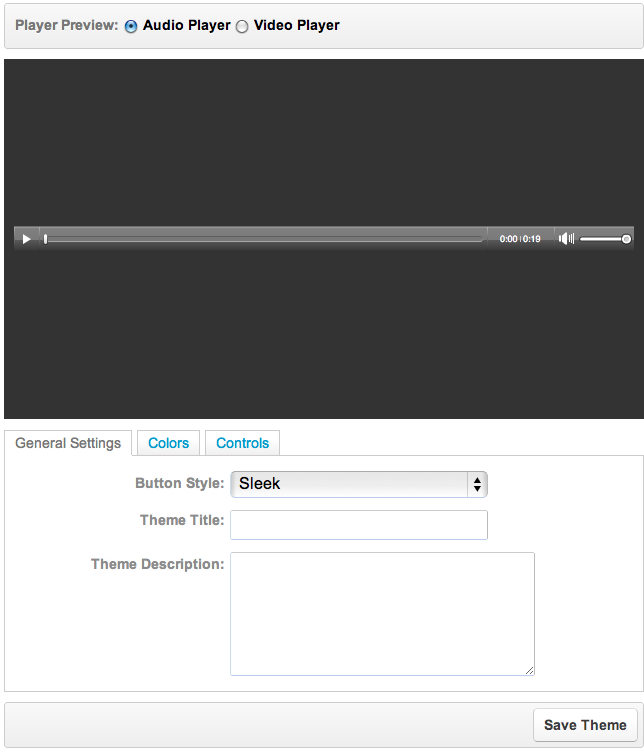
After logging into your AudioAcrobat account, click Themes in the left navigation menu to bring up more options. Click New Player Theme to bring up the Player Theme editor. Once loaded, you should see something like this:

Notice the Player Preview radial button at the top? If you’re a member on either the Personal or Professional Plan, you can select the Video Player option to design Video Player Themes.
For today’s tutorial, we’ll be sticking to the Audio Player Themes, which are available to all members, regardless of plan.
Step 3: Customize and Save Player Theme
One of the first things we recommend when customizing your new AudioAcrobat Player Theme is to give the new theme a Title and Description which will help identify the purpose of the theme in the future.
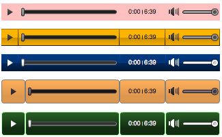
Next, let’s take a look at the different Button Styles:
Sleek
Modern
Tube
Plain
Dark
Light
Minimal
Dark Tube
All of the above selections can be further customized by making a selection and moving over to the Colors tab.
Here, we have the option to modify both the Button and Icon Color, which can be done by clicking on the icon to the right of either selection and clicking and dragging our mouse cursor within the color palette as seen in this spiffy animated GIF.
After making any color adjustments, we’ll be moving over to the Controls tab for some fine tuning.
Looking at the Player Theme examples above, we see that all of the available Buttons are selected. Using the check boxes under the Controls tab, we can choose to add/remove any of the buttons we like, such as Play/Pause, Seek Bar, Play Timer and Volume Control.
Additionally, Button Padding can be used to introduce spacing between each individual button for a more segmented look.

When satisfied with your custom Audio Player Theme press the Save button at the bottom.
Are there Player Theme features not seen above that you’d like to recommend?
Comment below and connect with us for daily updates!
- Follow AudioAcrobat on Twitter
- Become a fan on Facebook
- Join our group on LinkedIn
- Subscribe to AudioAcrobat RSS
Want to learn more about AudioAcrobat? Go ahead, give it a try yourself by signing up for a 30 day Free Trial or join one of our FREE Training Classes without signing up for squat. Already have an account? Login HERE.
Did you know that AudioAcrobat has a built-in affiliate referral program? Earn 33% commissions, monthly!

![[New Video] How To Create A Custom Player Theme](https://i2.wp.com/blog.audioacrobat.com/wp-content/uploads/2012/04/new-aa-features-video.png?resize=350%2C200)

[…] to determine the alphanumerical value for any color in the world… perfect for designing a new Player Theme or Classic […]